Interactive Graphic Narrative


My original plan was to use unity however time restrained me from being able to use unity, I attempted to teach myself how to use flowcharts in unity but it was taking too long and I wasn’t getting anywhere so I decided to show how the interaction would occur, I started out by importing the comic into after effects as the main background image, I then created 2 different arrows, one for the page turn and one to click, I then transformed the shapes into their positions and proceeded to keyframe the arrow to certain positions to show interaction with the comic and it’s transitions. The arrow goes along the screen as if a person was controlling it and bounces from item to item, this is designed to simulate human actions by then clicking in the corner to move along to the next page.

The original design was supposed to feature an option where you could click on a character and an arrow would shoot out and land on an enemy in the next slide, however I was not able to complete this due to time restraint and therefore opted for this method to demonstrate the transitions. I also would’ve liked to added in a sou d effect for certain items ie a bang sound for the bullet being shot at green arrow. If I had managed my time better and got to grips with unity faster then I would’ve liked the extra bits and pieces to polish it off and make it look industry standard.

I showed the short clip to a few of my peers, I then asked for their opinion on the clip and this is what I received; “it’s a bit too short of a demo but with more time and effort I reckon you could’ve made that way better.” “I like the ideas you had and the comic looks good just needed those extra ideas in there and it would’ve been perfect.”

I took these compliments and pondered about how my peers saw my work, in future I will be sure to add these details in and try harder to manage my time properly as it seems people would’ve actually liked to see the other bits in action.


Unit 65: Task 2

I have been moved through to the next round of the Tall Story Studios Competition and now have to create a working interactive animated graphic narrative, the information and listed below is to show how I plan to create the interactive graphic narrative and how it all ties in together and how it suits the client brief that Tall Story Studios has set for me.

Below is the final comic to show the style I will stick to and the dark colour palette that I started with.

I plan to have the arrows move across the screen whenever someone moves the mouse over that panel.

I will have Arrow zipline down from the bridge when you click on the bridge.

Bullets will fly too when a mouse goes over it.

I may include some door openings or maybe a bird flying past in the background.

I will most likely stick to the same colour palette but may feature a ‘swoosh’ sound effect when the arrows and bullets fly across the screen, the night scenes I could feature a cricket chirping noise, When the character hangs his hood up the mouse could make the light shine brighter and the door could open or close.

Below is a Mindmap of my ideas for the Graphic Narrative


Ben's Narrative Mindmap.png

Legal issues essay here : Research into Graphic Narrative Idea

The software I will use to create the interactive animation of my comic will be Adobe Illustrator as it allows me to create vector-based images I will use fungus the plug in for unity as it is the easiest to use and allows the creation of vector based animations for web. I will follow a similar basic dark colour palette and layout through the graphic narrative and web animation to set the mood for a dark twisted plot line and to show that the story is set during the night over a few days. This will get the reader intrigued and want to know more about the story, and they will begin to feel the emotions that the main character feels. The interactive assets will simply make the reader become further immersed in the story of the graphic narrative and will then hopefully fit the target audience.


Evaluation For Graphic Narrative

Evaluation For Graphic Narrative

The structure of my graphic narrative is an open multi strand narrative, it features a beginning; the initial intro to arrow, the middle; the fighting and struggles faced during fights and an end? The climax at the end. I ran into a few issues during production, such as; selecting the wrong section or colouring a certain part in the wrong layer and  ending up with colours on the wrong bit and unable to rub it out without removing the whole thing.

Overall I think the project was a success, however it didn’t come without its hardships, for example I had no knowledge of how to use Photoshop and I had to teach myself from scratch in order to create the assets for the graphic narrative, so I tried to get some help from Ben and Lynne and soon I had figured out the hotkeys and shortcuts for Photoshop from there I managed to find a flow and some direction for my graphic narrative, The story started out with a traditional opening and followed in chronological order throughout,*Spoiler Alert* it starts with Arrow taking down a bad guy to show his talent with a bow and arrow, then he can be seen mentoring Arsenal and tries to use the shadows to show Arsenal the benefits and how in their line of work it is very important to utilise anything he can, they go on another call out, this encounter doesn’t end as well as planned and Arsenal goes into a fit of rage, from there he tries to fulfil Arrow’s objective of taking down the crime boss of the city, and to finish he hangs up his hood and leaves, the narrative is then left with an “end?” this small detail is important as it shows that Arsenal may have to return for some unknown reason and allows room for a sequel or some form of follow-up. Within the Narrative there is a few small details to show time movement and how things have changed for example; the first rooftop scene doesn’t feature a water tower yet when Arsenal returns alone to the same spot a water tower has been built, doing this helps the reader understand that time has moved and it’s not just set in one room or one time frame, it spans across many months.

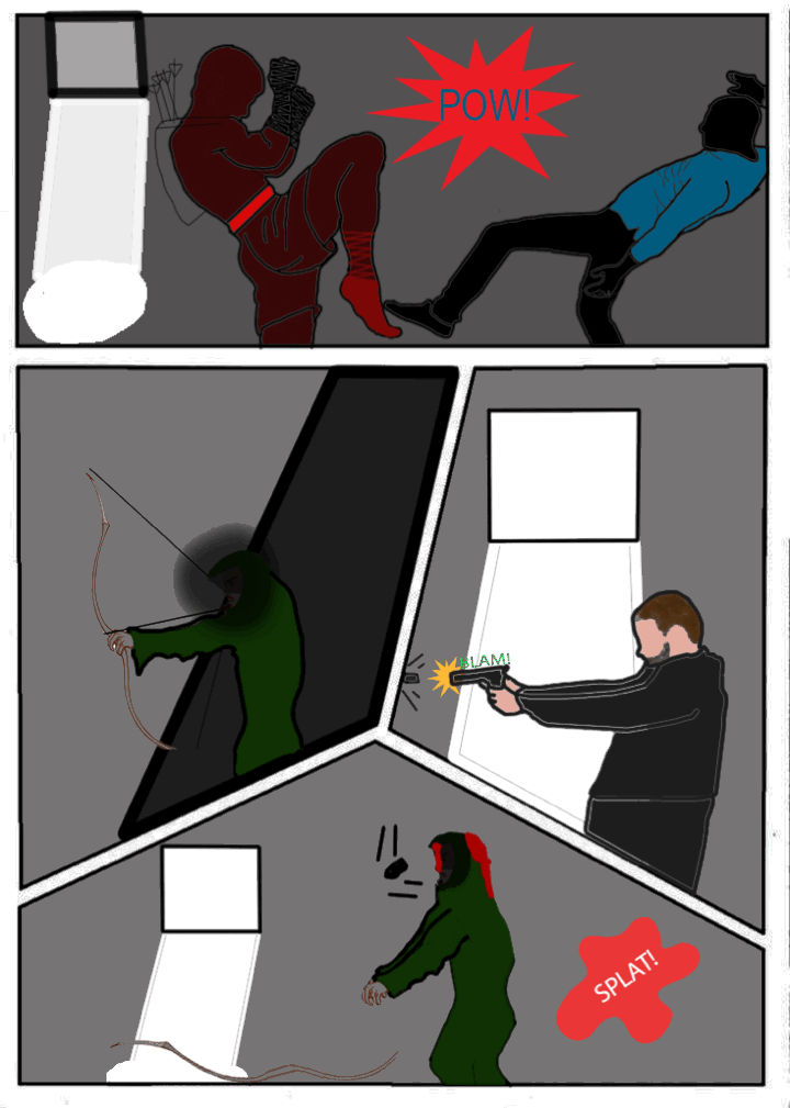
The text I have used for the speech and actions are very bold to help the readers understand and feel the impact of the words, this is a very common trait within popular comic books as it stands out and draws in the reader to discover why a certain person is saying that or why someone has just been hit. There is a common colour palette throughout the comic, I have chosen to use dark colours or red these both symbolise something the dark colours help to show that it is night during all of these scenes and the red is just so that it makes the comic seem like it revolves around Arsenal. Red also symbolises danger which is what Arrow and Arsenal are always facing.

This comic is based in Central City as opposed to the home city Starling/Star City, this has allowed me to create a spinoff in a place that big fans will know but some may not so, to them it’s a new place, a new story and a new start. The universe is parallel to the original storyline so may feature people such as the Flash or Black Canary, this will allow me to market it bigger and better, furthermore because of the parallel universe I can then have the Flash turn up and drop references and hints at the original world and seem really confused at the death of Arrow.

During production I had a few complications as stated earlier, but thanks to my time management I was able to get the project in on time and with some feedback from my peers too, I have been told that it was a “good comic” and “has great potential to expand the story further.” This gives me confidence in my comic and shows that it may possibly be industry standard if it had a bit more work on it and more time to develop my skills. The graphic narrative seems to grow in quality as my skill using Photoshop grows because at the beginning the quality is somewhat rough and shoddy, but towards the end it is clear that more time and effort was put into the work as the final product looks a bit more polished.

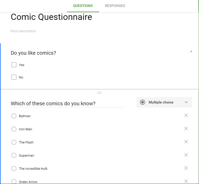
I made a questionnaire to find out how my product would sell in the target audience that I had chosen and I discovered that lots of people liked my idea for a spin-off comic that strays away from the main storyline,  also they liked the idea of having a ‘side’ character as the main character and have special guest characters every now and then, for example people would like for the Flash to be in it in a few volumes etc. This meant that I didn’t need to change my idea as it seemed popular too my peers. The initial idea was a slight issue as I’m not very creative and I’m not too good at coming up with ideas etc so I decided I would create a spin off based off my favourite “superhero.” I struggled to create the initial idea at first as I didn’t want to face any copyright issues and the actual art styles had to be influenced by the internet. I basically grabbed a picture or got a picture I took in a certain position and traced the outline and coloured it and added small details to make it look different then I removed the original file so I wasn’t using a picture copy, during this process i kept running into an issue where I would forget to create a drawing layer and therefore would end up with a drawing on the original file, This meant that I had to redo it which caused more time to be wasted, however soon I picked it up properly as can be seen in my work as it progresses.

In conclusion I feel that the client will enjoy the finished product but may not feel it is perfect if I had learnt Photoshop sooner, then I may have been able to finish the product sooner and with a higher standard, to create the assets I grabbed pictures I took and traced the base outline of it, also I used the internet for certain poses that I was not able to achieve like the zip lining scene. I then coloured it and added little lines and bits of shading to make the final image mine and sometimes it was to represent different lighting within the scene.

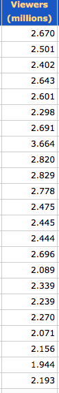
I received an average score for my graphic narrative from my peers, the graphic narrative was a somewhat success as it wasn’t the worst one there however wasn’t the greatest either. If I had to chose a novel to buy from one of my peers/competitors it would have to be Ben Halling’s war novel it has incredible amounts of detail and the story seems very intriguing. Below is the chart that shows everyone’s scores.

Chart of results.PNG

Research into Graphic Narrative Idea

screen-shot-2016-10-07-at-14-33-22
View count for TV show
screen-shot-2016-10-07-at-14-32-08
Searching copyright issue

The pictures above are screenshots of me researching the graphic narrative idea to see if I would find any issues of constraints. The top picture is the results I found on the most recent episodes of the TV show ‘Arrow’ that is aired on CW, the results seem to show how popular the show is and that the graphic narrative would have quite a large following and a wide target audience the only non suitable targets would be children as the show is rated 12. This means I am not restricted to having no blood or violence however may include a small amount of swearing and nothing too vulgar. The second screenshot is my research on the name ‘Arsenal’ which is the codename of the sidekick character (Roy Harper), I needed to check this as my main character is going to be Arsenal and it will be like a small spin off series that could be included in the ‘Arrow’ universe. If the name had come up as a  copyright issue then I would have to rename him to something else.

Primary:

I created a questionnaire for people to complete the results will determine whether or not my graphic narrative idea will be successful.

capture

Paperwork for Web Design/Evaluation

Screen Shot 2016-06-28 at 11.29.35.pngWebsite:

www.cockingtonchocolate.wordpress.com

PRODUCTION_SCHEDULE

equipment_needed

Website Proposal 

Production Diary

meeting-minutes

These are the pictures I created, I took and edited all the pictures myself along with the time lapse and the little gif in the corner of the webpage.

This slideshow requires JavaScript.

Evaluation:

In the initial planning of the website we spoke to the client asked about what colour scheme they wanted and what sort of content they wanted in the website, the lady settled on a light colour scheme but after testing how it looked we had to settle with a dark colour scheme to fit with the planning and look of the website, a light colour scheme would have clashed and contrasted the colours too much and you wouldn’t be able to focus on the media rich content in the website. We showed the client the edited design and she was happy with it. The content itself was chosen by the client, our team felt that this would be better as it brings the client into the work and makes it feel more personal to them. The dark brown colour was supposed to represent the typical milk chocolate look as this website was created for a chocolatier, because of the colour you can instantly tell what the website is about and it may entice customers to buy their wares.

The layout of the website was chosen by all of us as we felt it fitted the purpose of being media rich and featuring lots of information on what the company is and what they sell. The client was happy with the layout and everything was good, we used jpg pictures as they load quickly and set the resolution right, this made sure the websites was functioning and it didn’t take ridiculously long to load the images.

The media we used in the website was a mixture of some facebook photos of the workers and some of the above pictures I took and edited, the use of the photos is to make the website media rich, this provides a good experience and helps to give the professional look and feel, the pictures where finalised an chosen by the client. This is because in the real working world everything has to be run by the client because they are the ones paying you for the work, therefore we did exactly that and for most of the pictures they were happy but some of the photos were removed, we decided to add a little time-lapse, which I filmed and edited, this was to show how nice the area is and to make any customers want to visit the shop. We also added a little gif, which I created also, the gif provides a nice logo that is memorable and shows that this company is legit and is very professional. The logo helps to make the rest of the website media rich and attracts more people which is exactly what the client will.

in the end the client was very happy with the finished product, along with my team and I, all improvements were rectified and sorted after receiving feedback.

Website Testing:

This slideshow requires JavaScript.

Theseare screenshots of how the website looks on Safari, Firefox and a tablet/smaller screen, the wesbite works well with all types, therefore I have concluded that the website functions as expected.Screen Shot 2016-06-28 at 11.29.35.png

This is a wireframe design for the website, it will feature a big header, a big picture along with a caption or a piece of text to the left.

Website Design Documentation

First we started our website design by looking for ways to improve the website and why it needed improving, then we set out to create improvements for each asset that didn’t suit the website. This included changing the whole colour scheme and other important assets that I will discuss in more detail soon. Our website was englishriviera.co.uk, this website was chosen out of a pile of other websites at random.

The colour scheme for the original website was a light blue and white stripe with some mismatched colours scattered around like purple, dark blue and red; these colours were very strange as they were just thrown around and not very organised, to improve this we decided to use a simpler blue as the header and included a white text colour along with a picture of Torbay’s most iconic symbol the palm tree. We then continued to add a white theme and kept to the same blue for buttons etc, we felt like that would allow users to feel relaxed with the nice design and not be overwhelmed by an overly complicated colour palette.

The next improvement we worked on was the arrangement and organisation of the website as it felt like everything was packed into such a small space and the left over space was not managed well at all, to fix this we rearranged everything and decided a simple layout was best. the map of Torbay and a quick picture of the bay was added and instantly made a huge difference to how we perceived the website by making it look more homely and showed exactly where Torbay is for any visitors wanting to come to the bay.

The third issue was related to the space problem and arrangement of the articles and files, we decided that the main page was crammed with pictures and links to other websites so we made the whole thing nice and simple once again by moving all articles underneath one another in a single line with a small border of white around both the pictures and the text, this made it easier to focus on one article at a time instead of frantically searching around the page and trying to find whatever you are looking for.

These improvements impacted the whole design greatly and made the initial website look so much better, this was an important task as it made it easier to understand how websites are made and what sort of details we need to look out for when we come to making the final website properly.

My contribution: Everything above and planning the layout (Group manager.)

Paul’s contribution: Editing some assets in photoshop.

Sunny’s contribution: Creating and editing the top part of the website.

Maks’ contribution: Creating and wireframing the bottom part of the website.

Feedback Evaluation

This blog post contains views that were expressed today when I showed my trailer of Donkey Kong, I had very mixed reviews from a small group of 5 people, there were others but there results were not recorded. The initial preview was not expected to be very good however it managed to pull through when the reviews came through and I had many good feedback but also quite a few bad reviews too and ways of improving too.

Sound

One of the comments that was said about the sound in my trailer was that it worked well to immerssevely draw the audience in and get them interested in what they were watching, this comment helps me understand how my inclusion of sound was good and fitted the theme of the trailer, however not all of the reviews were good as I had a few comments on how the sound was poorly edited in the beginning, people were saying that they noticed the “go” bit at the beginning, this was made apparent after I had uploaded the video and is a completely fair comment as I know how to improve and get why it was raised as an issue.

Motion Graphics

The motion graphics had mainly positive feedback especially when it came to the quality and timing of them, one review stated that the graphics were “clever and unique” lots of people liked the 1 UP graphics when Mario hit the barrel and when the little explosion appeared too, however one review stated that the motion graphics had “no style” but when I questioned said person about what they meant they were unable to give me a reason or any sort of improvement that could be performed on the animation to make the motion graphics include some sort of “style.” That is an example of one of the many unhelpful comments I received but one that did help was about how the graphics could have been slowed down so people could see it for longer “graphics were too fast” this comment is one that quite simply describes how I can improve on it so I am happy with altering the animation for this comment due to it informing me of the issue.

Animation

The animation part of the trailer was given plenty of good and bad feedback which is good because most of it is useful and states how I can improve it, the best comment was about how the animation was smooth and fitted perfectly with the live action aspect of the trailer, the overall thoughts on the animation were mainly positive but obviously there were a few errors and some comments indicate how these errors can be fixed such as “make the barrels move at a consistent speed throughout” I completely agree with this statement and it is a great detail that was spotted by this person, this can easily be solved and has a clear reason as to why they thought this. To fix it, all I need to do is speed up the barrels’ movement towards the end of their path on the map.

Improvements

Most of the comments were very useful in the way that they showed me exactly how I should improve my trailer, the main points were focused on how the beginning featured me saying “go” so to rectify this mistake I only need to crop the beginning part of the video and make sure there is no white noise in the background, another way I could improve the animation is by editing the speed and timing of both the barrels and the movement of Donkey Kong’s arms, I can just tweak the key frames and positioning to accomplish this, I am quite happy to apply these changes if the opportunity is given, one final improvement that I could apply is I could edit the time it takes for the actor to reach the door because he currently slides towards the door so if I made it so in his few steps he made it to the door that would make it much better and give a much more professional look and feel to it.

The overall animation was rated somewhat highly with an average score of 7/10 there was one anomaly of 5/10 but that was 1/5 reviews so the overall majority seemed to enjoy it. Many people also considered this to be industry standard, excluding the mistakes, and the unique use of live action and animation together made the whole animation work very well, the reviews said “live action + animation were a good combination” so I am very pleased with my trailer and with the reviews it received from my peers and tutors.